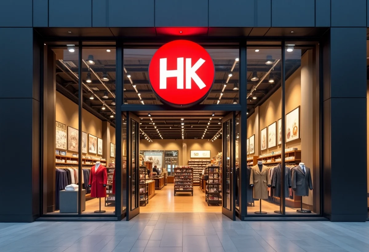
Large retail chains are investing heavily in creating strong and recognizable symbols. These symbols, whether logos, colors, or mascots, play a fundamental role in brand identity and perception.
A well-designed symbol can evoke emotions, create a bond of trust, and differentiate from the competition. For example, the Carrefour logo, with its blue, white, and red colors, instantly evokes the image of an accessible and trustworthy store for consumers. Symbols are essential for anchoring a brand in the public’s mind and strengthening its market presence.
Analysis of Symbols in the Branding of Major Retail Chains
Major retail chains, such as Migros, Coop, and Fnac, use symbols to stand out in a competitive market. The Auchan logo, for example, with its red bird, symbolizes accessibility and proximity, creating an emotional connection with its customers.
Swiss Chains: A Case Study
- Migros: A historic cooperative in Switzerland and market leader in food distribution. Its orange logo is synonymous with trust and reliability.
- Denner: A soft discounter integrated into Migros, uses simple yet effective branding to attract an audience looking for good deals.
- Coop: The second-largest food distribution cooperative in Switzerland, its red and white logo inspires safety and quality.
These symbols are not chosen at random. They convey values and promises that consumers immediately associate with the brand. Valaisanne Holding (LVH), having acquired PAM and Proxi stores, also relies on strong symbols to mark its expansion.
Expansion and Differentiation
Magro/Casino, currently expanding in Romandy, perfectly illustrates the strategic use of symbols to penetrate a new market. Its branding aims to reassure and attract a local clientele already attached to well-established chains.
Manor, by investing in the construction of new shopping centers, reaffirms its presence in the Swiss market. Its logo, with warm colors and a sleek design, embodies innovation and dynamism.
Impact of Symbols on Consumer Perception and Behavior
Symbols play a fundamental role in how consumers perceive and interact with brands. Patagonia, for example, uses strong symbols related to environmental preservation. This positioning reinforces its image as a committed brand and attracts a clientele concerned with ecological issues.
Tesla, another iconic example, embodies innovation and sustainable mobility. Its minimalist and futuristic logo reflects a forward-thinking vision, positively influencing consumer perception of electric vehicles. Tesla does not just sell cars, but a vision of the future, which explains the massive consumer support.
- Spotify: The music streaming service uses symbols of discovery and personalization, offering a unique user experience.
- Airbnb: With its symbol of authentic travel, Airbnb positions itself as an alternative to traditional stays, creating a community of travelers seeking local and unique experiences.
Lush and Beyond Meat also illustrate this dynamic. Lush, committed to ethical production, attracts consumers sensitive to sustainability and fair trade. Beyond Meat, on the other hand, positions itself on environmental responsibility, appealing to a clientele seeking alternatives to meat.
These examples show that symbols are not just simple graphic elements. They convey values and commitments, thus influencing consumer choices and behaviors. The perception of brands like Patagonia, Tesla, or Spotify is directly linked to the strength and coherence of the symbols they use.